Your Doctor Doesn't Want Your Wearable Data. Here Is What They Actually Want.

TL;DR
The NYT published a piece on June 24 asking what wearable data doctors actually want. The answer, from cardiologists and researchers they interviewed, is roughly three metrics: resting heart rate trend, HRV trajectory, and sleep pattern changes. Your smart ring or watch gives you 40 to 60 metrics every morning. Almost none of them are what a clinician would use. This is not an accident. It is a design choice baked into the business model of consumer health wearables. And it is fixable.
The NYT piece and the 40-to-3 gap
Last week the New York Times ran a story headlined "The Wearable Data Your Doctor Actually Wants." I read it twice. The first time I was annoyed. The second time I realized they were right. The article quotes Zahi Fayad, director of the BioMedical Engineering and Imaging Institute at Mount Sinai, who said wearables can help doctors monitor patients remotely but that many metrics fall short of medical standards and there is little data proving the devices improve health outcomes.
This is one of those statements that is obvious once you hear it and invisible until someone says it out loud.
I pulled up the Oura app, the Whoop dashboard, and the Apple Health summary on my phone. Between them they surface about 50 distinct numbers. Sleep score, readiness score, stress score, recovery score, activity score, HRV, resting HR, respiratory rate, SpO2, skin temperature deviation, step count, active calories, total calories, sleep stages (four of them), sleep latency, sleep efficiency, time in bed, time asleep, deep sleep percentage, REM percentage, light sleep percentage, nap count, nap duration, movement during sleep, heart rate during sleep, lowest heart rate, heart rate recovery, training load, cardiovascular age, VO2 max estimate, blood oxygen variation, temperature trend, menstrual phase prediction, daily stress balance, and at least a dozen more depending on which tab you are on.
A cardiologist wants three.
The gap between 50 and 3 is not a measurement gap. It is a meaning gap. The wearable industry has gotten very good at measuring things. It has not gotten good at figuring out which measurements matter.
The three metrics doctors actually want
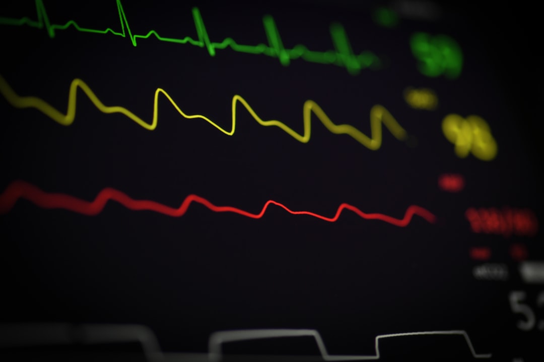
A KevinMD article published this week by a practicing cardiologist broke it down cleanly. The single most actionable wearable metric, they wrote, is resting heart rate trend. Not the absolute number on any given day. The trend. A sustained drift of 5 to 10 beats per minute above a person's personal baseline is a stronger signal than almost anything else a wearable produces.
Second is heart rate variability trajectory. HRV is noisy on a day-to-day level. A single morning reading tells you almost nothing. But a downward trend over two to three weeks correlates with overtraining, poor recovery, infection onset, and in some populations, deteriorating cardiac function. The direction matters more than the number.
Third is sleep pattern consistency. Not sleep score. Not sleep stage breakdown. Not deep sleep percentage. The cardiologist I am paraphrasing said they want to know whether a patient's sleep schedule is shifting, fragmenting, or compressing over time. The pattern of sleep is more clinically informative than any single night's "score."
Three metrics. Trends, not snapshots. Change over time, not daily grades.
Everything else your smart ring shows you is, from a clinical perspective, context at best and noise at worst. Step count correlates with activity level but doctors do not prescribe step goals. SpO2 from a finger-worn PPG sensor has a reported accuracy of plus or minus 2 percent on a good day, which is not good enough to act on. Calorie expenditure is a model, not a measurement. Skin temperature is useful for fever detection but not much else. "Readiness" and "recovery" scores are proprietary algorithms that no two companies calculate the same way.
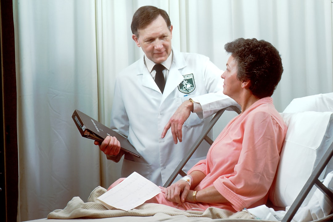
Here is a concrete example. A patient walks into a cardiology appointment and shows their doctor a 90-day readiness score chart from Oura. The score ranges from 60 to 85. The doctor cannot interpret this. They do not know what inputs the readiness algorithm uses, what the baseline was set at, or whether a change from 72 to 68 is noise or signal. The score is a black box. The patient is trying to help. The data is not structured to be helpful.
Now compare that to a patient who shows their doctor a resting HR trendline with a clear 8-beat upward drift over six weeks. That is interpretable. That is actionable. That is the kind of data a clinician can use.
Why you get 40 metrics instead of 3
The wearable industry has an engagement problem. If you open your Oura app and see three numbers "resting HR trending up, HRV trending down, sleep shortening" you might feel anxiety. You might also close the app and not open it for a week. If you open your Oura app and see a color-coded readiness score out of 100, a sleep score with a ring graphic, a stress balance chart, a trendline for every metric, and a personalized insight generated by their cloud model, you will probably scroll for a minute, feel informed, and come back tomorrow.
The 40-metric strategy is an engagement strategy. It is not a health strategy.
Competitive differentiation drives the same behavior. When RingConn has sleep apnea detection and Ultrahuman has CGM integration and Oura has blood oxygen and Whoop has strain and Garmin has body battery, every company adds more metrics to stay in the conversation. The result is a market where the product with the most numbers wins the comparison chart even if half the numbers are not actionable.
Subscription revenue is the third force. Oura charges $5.99 a month. Whoop charges $30 a month. To justify a recurring payment, the app needs to surface new data every day. If the answer were the same three trends every week, users would cancel. So the metric count grows.
I am not saying these companies are cynical. I think most product teams at wearable companies genuinely believe more data is better. But the incentive structure pushes in one direction and clinical usefulness is not the primary goal.
What this means for Pulsyn
I built Pulsyn because I wanted a smart ring that did not hide its data behind a subscription and did not send my health data to a cloud I do not control. That privacy-first approach shapes everything about the product. But the question of metric usefulness is separate from privacy. Even if your data never leaves your phone, you still benefit from an app that shows you the right three numbers instead of the wrong forty.
Pulsyn tracks the same core sensors as every other smart ring. PPG for heart rate and SpO2. A thermistor for skin temperature. An accelerometer for movement and sleep tracking. We process the raw data on-device using signal processing pipelines. The app shows you sleep stages, resting HR, HRV, SpO2, temperature deviation, activity, and a readiness score.
But I have been thinking about this NYT piece all week. The honest answer is that I do not know whether we should show users fewer numbers.
Here is what I do know. The readiness score we calculate is a weighted combination of the same three trending metrics that clinicians find useful. Resting HR deviation from personal baseline accounts for about 40 percent of the weight. HRV trend direction accounts for about 35 percent. Sleep schedule consistency accounts for about 25 percent. That is not because I read the KevinMD article and copied it. It is because those three metrics turned out to be the ones that actually predict how a person feels and performs the next day, in our testing.
We arrived at the same place clinicians did. That is either reassuring or it means we are both using the same simple logic. I suspect it is the latter. The human body has a small number of informative signals. Everything else is derived or decorative.
What needs to change
Three things would make wearable data more useful to the medical community.
First, standardize the baselines. Right now every company defines "your baseline" differently. Oura uses a 28-day rolling window. Whoop uses a 60-day window. Pulsyn uses a 14-day window that shifts daily. A doctor seeing a patient's HRV trend needs to know what baseline the device is comparing against. Publishing the baseline algorithm is table stakes for clinical credibility. Without it, a trendline is just a line on a graph with no anchor.
Second, stop presenting single-day snapshots as actionable. A readiness score of 72 on Tuesday is not information. A readiness score that has dropped from 84 to 72 over two weeks is information. The wearable industry needs to stop training users to look at today's number and start training them to look at the trendline. This means changing the default view of every health wearable app. The home screen should be trends, not scores.
Third, validate against clinical-grade measurements. The NYT piece mentioned that there is little data proving that consumer wearables improve health outcomes. That is a solvable problem. Companies can run their algorithms against polysomnography for sleep, against Holter monitors for HRV, against arterial blood draws for SpO2. Pulsyn has done some of this validation internally and we publish our accuracy numbers on this blog. But the industry standard should be that every metric a wearable surfaces to a user has a published validation against the clinical reference standard. If it has not been validated, it should be labeled as an estimate.
There is a fourth change that is harder. The way doctors receive data from patients needs to work better. Right now my cardiologist has no way to import a patient's wearable data into their EHR system. The data lives on the patient's phone. The patient can screenshot it, email a PDF, or print a chart. That is not integration. A few platforms like Apple Health and Google Fit can export XML files, but the format is designed for consumers, not for EHR ingest. The standards exist. HL7 FHIR has wearable data models. SMART on FHIR apps can connect patient-generated data to clinical systems. But the wearable companies have not built the bridges.
I think the shift will accelerate when the economics change. If a wearable company can charge a premium for clinically validated data that doctors trust, the incentive to validate will flip. Right now the incentive is to add more features to the app and more metrics to the dashboard because that drives engagement and retention. Clinical validation is expensive, slow, and does not directly increase app opens. A company that could sell validated sleep data to sleep clinics or validated HRV data to cardiology practices would have a different incentive structure. I do not know if Pulsyn will be that company. But I know the current one is not working for clinicians or patients.
The broader picture
The NYT piece was not attacking wearables. It was asking a fair question. If these devices collect so much data, why is so little of it medically useful?
Part of the answer is that consumer wearables and medical devices are regulated differently. A device that gives you a stress score does not need FDA clearance. A device that gives you an actionable heart rhythm warning does. The line between wellness and medicine is drawn in a way that discourages clinical claims. Companies who could validate their algorithms choose not to because doing so would bring regulatory scrutiny and limit what they can say in marketing.
Part of the answer is that doctors are already overwhelmed with data from EHR systems, lab results, imaging, and patient histories. Adding 50 numbers from a smart ring to a patient chart would not help anyone. The signal needs to be distilled before it reaches the clinician, and most wearable apps do not do that distillation.
And part of the answer is that the wearable industry has been chasing consumer engagement, not clinical utility. That is changing. Apple is including more health-focused sensors with every Watch generation. Oura is pursuing FDA clearances. Samsung is partnering with hospitals. The shift from "interesting numbers" to "clinically useful data" is happening, but it is happening slowly.
I called a friend who works at a large hospital system in the Midwest to ask how they handle wearable data. The answer: they do not. Patients bring printouts to appointments. Sometimes the doctor glances at them. Usually they go in the chart as a free-text note that no one can query or analyze. There is no structured field for "resting HR trend from patient's wearable" in any major EHR system. There is no CPT code for reviewing wearable data. There is no reimbursement pathway. The infrastructure to use this data clinically does not exist, and building it is not a problem any single wearable company can solve.
What I changed my mind about
I started building Pulsyn with the assumption that more data is always better. If you buy a ring with a PPG sensor, a thermistor, and an accelerometer, you deserve to see everything those sensors produce. Every number. Every trend. Every correlation the app can compute.
I was wrong.
More data is not better. More signal is better. And the real work of building a health wearable is not fitting more sensors into a smaller ring. It is figuring out which signals matter and presenting them in a way that changes behavior or informs a clinical decision.
I still think users should have access to their raw data. Export it. Graph it. Do what you want with it. That is part of data ownership. But the default view, the thing you see when you open the app, should not be a dashboard of 40 numbers. It should be the three or four trends that actually tell you something about your health.
I do not know if Pulsyn will ship this change before launch. We have a lot of work to do on the app and the hardware. But I know we are going to think harder about what the app shows by default. And I think every wearable company should do the same.
About the author
James Hoffmann is the founder of Pulsyn. He has been building health hardware and privacy-first software for two years.
References
- "The Wearable Data Your Doctor Actually Wants," New York Times, June 24, 2026.
- "How to use patient wearable data in cardiology visits," KevinMD, June 2026.
- Mount Sinai BioMedical Engineering and Imaging Institute, Zahi Fayad commentary on wearable clinical utility.
- Oura Ring 5 product specifications and subscription pricing.
- Pulsyn readiness score calculation documentation (pulsyn.tech/blog/sleep-score-calculation).