Wearable Accuracy Has a Reporting Problem, Not Just a Sensor Problem

Wearable Accuracy Has a Reporting Problem, Not Just a Sensor Problem
Most arguments about wearable accuracy start with sensors. Green LEDs, skin contact, motion. Those matter, but they are only half the story. The other half is reporting: which tests a company cites, which metrics it leaves out, and how wide the error bars are in daily life compared with a controlled lab.
If you own a smart ring or watch, you have felt this split. Overnight heart rate looks steady and believable. Sleep stages feel less certain. Strain or calorie numbers can swing by hundreds between brands on the same day. That pattern shows up in independent research too, and it points to a category issue around accuracy rather than one bad product.
I am writing this as founder of Pulsyn. We are building Rune 1, a $200 one-time ring with no subscription ever, now on $20 reservation and planned to ship in Q3 2026. We have not shipped yet, so I cannot point to our own large validation set. What I can do is explain how the rest of the field tests and talks about accuracy, and what we think clearer reporting should look like.
How validation studies test wearables
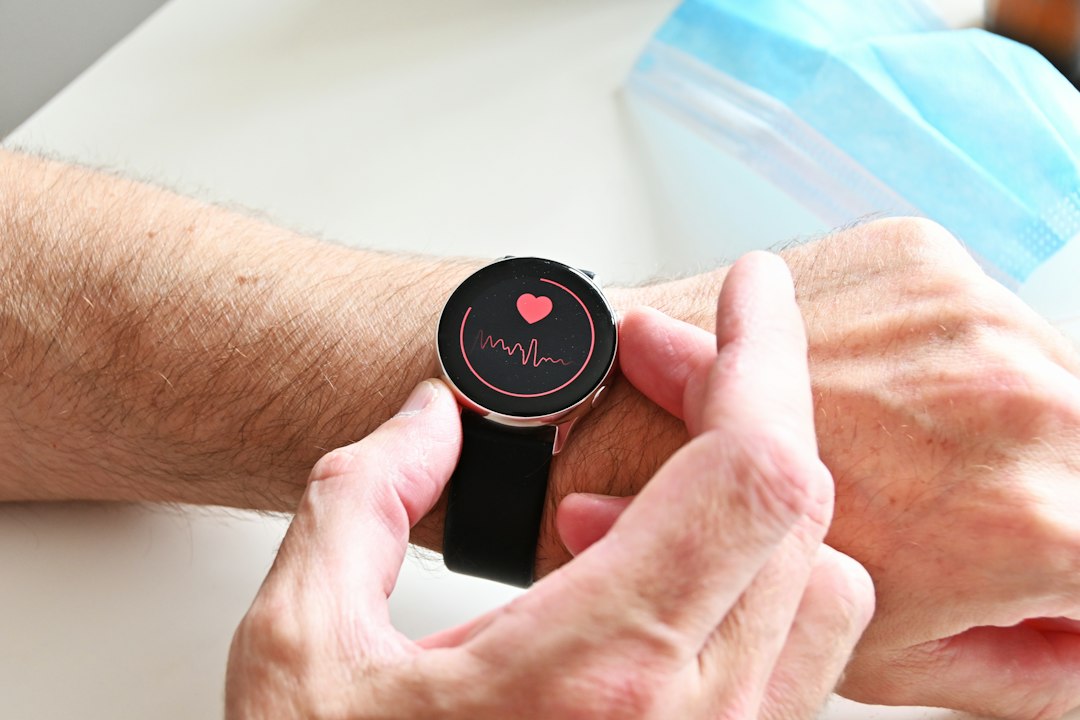
Photo by Nik on Unsplash
A validation study usually compares a wearable against a reference device under set conditions. For heart rate, that reference is often an ECG chest strap or clinical ECG. For sleep, it is polysomnography in a sleep lab, with electrodes, airflow belts, and trained scorers. For oxygen saturation, it is arterial blood gas or a cleared pulse oximeter during controlled desaturation.
Protocol details change the result a lot. Resting heart rate in a chair is easy for optical sensors. Walking on a treadmill adds motion. High intensity intervals, cold hands, darker skin tones, tattoos, and loose fit all add noise. A study that reports mean absolute error of 3 to 5 beats per minute at rest is not promising the same error during sprints in winter.
Sample size and population matter just as much. Many published ring and watch studies enroll 20 to 60 adults, often young and healthy, with limited skin tone range. That keeps the work practical but limits what you can claim. A 30 person lab study can flag big failures. It cannot prove the device works equally for a 68 year old with atrial fibrillation and a 24 year old marathon runner.
Time window is the third detail buyers miss. Vendors often quote best case windows, like five minute resting averages overnight. Independent teams often test second by second or minute by minute across 24 hours. The second method almost always looks worse because it includes motion, gaps, and brief dropouts. Both methods can be honest. They just answer different questions, and only one reflects how you will use the numbers.
When you read any accuracy claim, look for four facts: the reference device, the activity mix, the subject count and makeup, and the time resolution. If any of those are missing, you don't have a complete claim. You have a headline.
Why marketing numbers look better than independent tests

Photo by Susan Q Yin on Unsplash
There is a consistent gap between company white papers and university retests. Company reports tend to use clean data, current firmware, and tight wear instructions. University teams tend to buy retail units, follow the quick start guide like a normal buyer, and include messy real world nights.
Data exclusion rules explain part of the gap. It is common to drop periods with low signal quality before scoring. That is reasonable engineering, but the dropout rate should be stated next to the error rate. An error of 4 beats per minute after dropping 12 percent of minutes is not the same as 4 beats with 99 percent coverage. Coverage is part of accuracy for a device meant to be worn all day.
Firmware versioning adds another wrinkle. Optical heart rate and sleep models update often. A 2023 paper on firmware 1.4 does not describe firmware 2.1 in 2026. Companies rarely republish full validation after each update, and academics cannot retest every release. That leaves buyers comparing old independent data against new marketing data without knowing what changed.
Metric choice tilts the picture too. Correlation looks impressive even when absolute error is large. If a tracker overreads by 20 percent every day, correlation with truth can still be 0.9. Mean absolute percentage error, bias, and limits of agreement tell you more about whether the number is useful for decisions. Good reports show bias plus spread, not just correlation.
None of this means every vendor is misleading buyers. It means the present norm lets a careful reader see strong results while a casual reader misses the limits. The fix is not better sensors alone. It is fuller labels: reference, population, activities, coverage, firmware, and error spread in one place.
Sleep staging shows the accuracy gap most clearly
 Sleep is where the accuracy debate gets concrete. Most rings and watches now report light, deep, and REM. Polysomnography defines those stages with brain waves, eye movement, and muscle tone. A wrist or finger device has to infer them from motion, heart rate variability, temperature, and blood oxygen patterns. That inference works for sleep versus wake, and struggles with stage boundaries.
Published results follow a pattern. Sleep versus wake sensitivity often lands near 90 percent or higher, which means the device catches most true sleep. Specificity for wake is lower, often in the 40 to 65 percent range in lab studies, which means quiet wake in bed gets scored as light sleep. Two stage or three stage agreement with polysomnography often lands around 60 to 75 percent on an epoch by epoch basis, depending on the device and population. Those are useful ballpark ranges from public studies, not guarantees for any current model.
Why does that matter for accuracy as a category? Because total sleep time can look solid while stage times shift by 20 to 40 minutes. If you use total sleep and resting heart rate to guide training, the data are often good enough. If you try to optimize REM minutes to the exact minute, you are asking more than the inference can give.
Naps, split sleep, alcohol, illness, and late caffeine make staging harder. So does sleeping with a partner who moves, or a room that runs hot. Labs control those factors. Bedrooms do not. That is why your ring can score 92 percent agreement in a company slide and feel less precise at home.
For buyers, the practical test is trend stability. If deep sleep reads 45 to 75 minutes most nights and spikes to 130 minutes once, treat the spike as noise unless behavior changed. Look at seven night averages, not single night stage charts.
What a clearer accuracy label would include
Food labels work because they show the same facts in the same order. Wearables need a similar habit for accuracy. Not a single score, but a short table a buyer can scan in a minute.
A clearer label would start with heart rate by condition: rest, walking, running, and sleep, each with mean error, bias, and coverage. It would list the reference, the number of subjects, age range, skin tone distribution by a standard scale, and firmware version. It would state what share of data was excluded for low quality.
For sleep, it would separate detection from staging. Report sensitivity and specificity for sleep versus wake, then epoch agreement for three or four stage scoring against polysomnography. Report total sleep time bias in minutes, plus stage biases. A buyer could then see at a glance that total sleep is within 15 minutes while REM bias runs plus or minus 25 minutes.
For calories and strain, it would show wider bars on purpose. Energy expenditure from wrist and finger devices often misses by 15 to 30 percent in independent tests, with larger misses at high intensity. That does not make the metric useless for ranking hard days versus easy days, but it does mean you should not convert it directly into food targets without a buffer.
We plan to publish this style of table for Rune 1 after independent testing, with Readiness, Strain, and Body Battery all planned to ship in Q3 2026 alongside the ring. Our approach pairs on device models on Qwen 3.5 fine tunes at 0.8B and 4B with cloud review through DeepSeek V4 Flash and Pro via Fireworks.ai, under an assistant we call North. Contact and updates run through pulsyn.tech only. Until we have third party results on shipping firmware, any accuracy range we share will be labeled as internal and preliminary. That is slower than posting a single bold number, but it is the only way the number stays useful.
If you are shopping now, ask support for four items before you buy: the validation PDF with subject makeup, the firmware version tested, the coverage rate after exclusions, and sleep bias in minutes rather than just agreement percent. Vendors with solid testing will send it. Vendors without it will change the subject. That response tells you as much about accuracy as the spec sheet.